Onboard EU collectors
Components
234 components. Every one of them live.
Not screenshots — live components, composed into the kind of surfaces you'd actually ship. The same accessible, themeable primitives that build this entire site.
Layout
Stacks, cards, and dividers — the scaffolding every screen is built on.
Stack · Card · Divider
Stack
Flex rows and columns with token gaps.
Card
Surfaces with elevation, accent, and glow.
Divider
Labeled separators between regions.
Content region
Primary column
Grows to fill available width.
Aside
Wraps below on narrow screens.
Forms & inputs
Fields, selects, comboboxes, and toggles — accessible and themeable, the same primitives that build this site.
Selection
SNMP
Numeric & range
Sliders, ranges, spinners, dials, and ratings for precise input.
Slider
Range
Number spinner
Dial
72
Rating
Date, time & color
Pickers for dates, times, and color — keyboard-accessible and localizable.
Color picker
Tables & lists
Data tables, trees, and lists that scale from a handful of rows to thousands.
Data table
Network inventory
Node | State | Team | Health |
|---|---|---|---|
| core-router-01 | active | NOC | Healthy |
| edge-fw-04 | degraded | Security | Watch |
| dist-switch-12 | active | NOC | Healthy |
| collector-eu-2 | offline | Platform | Down |
| lb-public-03 | active | Platform | Healthy |
Tree
- Network
- Core
- core-router-01
- core-router-02
- Edge
List
- CollectionHealthy
- CorrelationHealthy
- AutomationActive
- Service deskOpen
Stats & meters
Statistics, sparklines, meters, and progress — the language of a dashboard.
Sample dashboard
Service overview
Active sources
1,284
+48
Open events
37
-12
Auto-resolved
92
+6
Event volume
Pipeline
- Collection46
- Correlation28
- Automation18
- Idle8
Charts
Sixty-six chart types, themed with the rest of your UI.
Line
| Category | Series 1 |
|---|---|
| Jan | 820 |
| Feb | 932 |
| Mar | 901 |
| Apr | 1290 |
| May | 1330 |
| Jun | 1450 |
Area
| Category | Series 1 |
|---|---|
| Jan | 120 |
| Feb | 200 |
| Mar | 150 |
| Apr | 280 |
| May | 270 |
| Jun | 360 |
Donut
- Resolved48
- In progress27
- Queued15
- Escalated10
| Slice | Value | Share |
|---|---|---|
| Resolved | 48 | 48.0% |
| In progress | 27 | 27.0% |
| Queued | 15 | 15.0% |
| Escalated | 10 | 10.0% |
Radar
| Axis | Sample |
|---|---|
| Coverage | 88 |
| Latency | 74 |
| Accuracy | 92 |
| Throughput | 81 |
| Resilience | 79 |
Cards & disclosure
Cards and accordions to group, frame, and reveal content.
Outlined
A quiet, bordered surface.
Accent
A top accent bar in the brand tone.
Elevated · glow
Lifts and glows on hover.
A complete, AI-native UI framework — components, engines, and a token theme system — that this entire site runs on.
Vue, React, and Web Components, all rendering from one shared set of behavior engines.
Yes — one token system re-skins the whole library, light and dark, including the charts.
Overlays
Dialogs, drawers, popovers, and tooltips — focus-trapped and portal-safe.
Click to open
Feedback
Alerts, badges, tags, skeletons, and toasts to keep users informed.
Deployed
Your changes are live across all regions.
Heads up
Two collectors are approaching capacity.
Action needed
A federation link is unreachable.
Badges:
primarysuccesswarningdangerTags:
ActiveStreamingDegradedToasts:
Skeleton (loading state):
Typography & code
Headings, prose, code blocks, key hints, and a live terminal.
Display heading
A section heading
Body prose in the muted tone, sized with tokens. Inline elements like a themed link and a key hint CtrlK sit naturally in the flow.
vue
<CButton variant="primary" tone="success">
  Save changes
</CButton>npx carapace add button
CButton ready - auto-imported in Nuxt
npm run dev
Local: http://localhost:3000
Planning
Kanban boards and timelines for work that moves.
Kanban
Backlog
2Tune correlation rules
In progress
1/3Federation health checks
Done
2Service-desk integration
AI summaries
Timeline
Incident activity
- 09:15Fault detectedInterface down on core-02
- 09:22Correlated to root causeUpstream link flap identified
- 09:31Workflow triggeredAutomated remediation started
- 09:45Service restoredInterface back online, alarms cleared
Media & identity
Images, avatars, and feature icons for rich, branded surfaces.
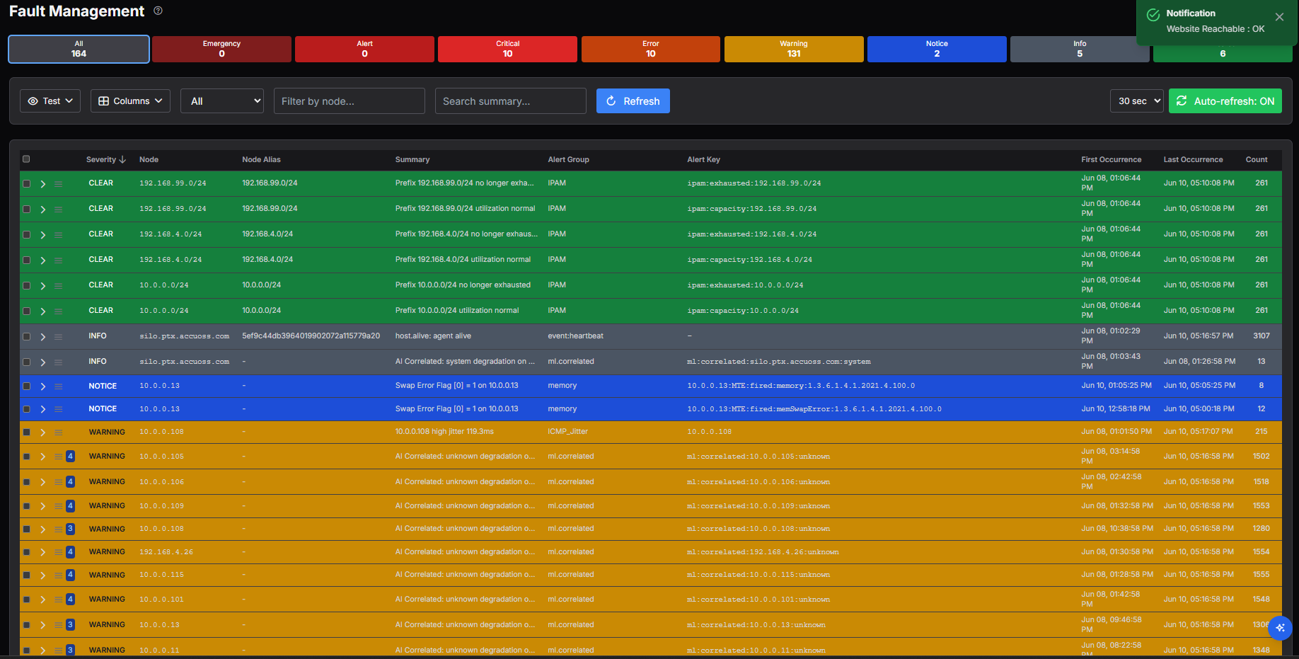
Image
Avatars
ACMWPNSR
Feature icons
Fast
Secure
Accessible
Themeable
The complete catalog
234 components. Every category, covered.
Grouped the way you'd reach for them. Hover any component to see exactly what it does.
Navigation
Menus, tabs, breadcrumbs and rails that move people through an app without a wrong turn.
Typography & code
Headings, prose and syntax-aware code — from a one-line label to a full editor.
Tables & lists
Data at any scale — virtualized grids, trees, pivots and spreadsheets that stay fast.
Media
Images, video, galleries and scanners, each tuned for crisp loading and zoom.
Overlays
Dialogs, drawers, menus and tooltips that float precisely and trap focus correctly.
Selection
Every way to pick one or many — comboboxes, multi-selects, transfers and switches.
Date, time & color
Calendars, pickers and swatches with range, locale and keyboard support built in.
Layout
The structural spine — shells, grids, splits and stacks that compose any screen.
Theming
Live theme controls — pickers, swatches and contrast tools wired to the token system.
Feedback
Alerts, toasts, progress and skeletons that keep people informed, never guessing.
Numeric & range
Sliders, steppers, ratings and gauges for precise numeric input and display.
Stats & charts
KPI tiles, sparklines and stat cards that make a number land at a glance.
Text inputs
Fields, textareas and masked inputs with validation and affordances handled.
AI & chat
A native AI surface — assistant, chat and context wiring, opt-in by design.
Layout utilities
Fine-grain spacing, dividers and helpers for the last mile of a layout.
Buttons & actions
Buttons, icon buttons and action groups with every state and size covered.
Desktop OS
A windowing layer — draggable windows, docks and panels for app-in-app UIs.
Forms
Composable forms with fields, groups and validation that scale to complex schemas.
Page sections
Marketing-grade sections — heroes, CTAs and feature grids, ready to assemble.
Cards & disclosure
Cards, accordions and disclosure that group and reveal content cleanly.
Game engine
Primitives from the plastron engine — real-time canvas, sprites and scenes.
Other
Specialist primitives that round out the catalog.
Planning
Boards, timelines and schedulers for work that moves through stages.
Files & drawing
Upload, annotate and draw — from a dropzone to a full canvas surface.
Identity
Avatars, tags and badges that label people, status and things at a glance.
Charts
A native, tree-shakable chart suite — no heavyweight dependency required.
Commerce
Pricing, carts and checkout building blocks for product and billing flows.
Developer tools
Inspectors, code and regex tools for building developer-facing UIs.
See a component you need?
Carapace ships these as a real product. Talk to us about adopting it, or about a build.